|
My Brain Has No Space For Your User Interface

My iPhone’s alarm went off at 5:30 this morning, and I walked to the kitchen to start my fancy coffee maker, with its LCD display and navigation. Then at my desk I booted up a Mac and a PC. I navigated several programs, each with their own custom UIs. If I need to drive somewhere, I’ll get to use my car’s now-archaic touchscreen interface. Later I might watch something on DirecTV, or load MLB.tv on the Xbox, play a blu-ray, or navigate through my smartTV for some streaming video. How many different user interfaces am I expected to deal with now? Many have similarities, but each expects me to remember its navigation, commands, organization and quirks. Behind these disparate UIs are companies fighting for market share. Sometimes their efforts create UIs that scream “Look at how advanced our software is! Come join us in the future!” They’re trying too hard, and making a mess in the process. Other times, it feels like the company knew the physical product (blu-ray player, giant TV) is what was going to sell you, and I imagine the executives realizing “oh—and there needs to be some software on it, in order to do x,y and z that we’re advertising on the box—make sure we get that done before it ships, too.” Most days I use UIs from Apple’s OSX and iOS, which are pretty similar but still different, as Apple has decided to define them as separate ecosystems: One meant for fingers, and one for the mouse. Microsoft disagrees, and is using their “Metro” UI across platforms (PC, Xbox, Windows Phone). At least they’re trying to do something about all of this UI insanity. Then we have third-party applications built for these platforms, looking to impress us with all their UI innovations and divergence from conformity. Cars, cable TV, blu-ray players, smart TVs, Wii, Playstation, Roku, Kindle, touch screen remotes, high-end coffee makers, fancy watches—they all present us with UIs that we’re expected to tuck away in our brains. I imagine this ‘UI storage’ area of my brain is like the box in my closet containing a rat’s nest of computer “dongly things" and cables. It retains most of this UI knowledge—and I can get at it—but I have to detangle it from fifty other UI assumptions I’ve gathered over the years. Let’s take something as simple as the ‘back’ button: We understand it, and we need it. One platform may have a hardware back button, while another wants you to press the ‘left’ arrow on a directional pad. On iOS, we have the hardware ‘home’ button. Browsers usually offer a software back button, and on OSX browsers you can also use a two-fingered trackpad swipe to go back. My car’s computer screen has a back button that looks like a U-turn sign laying on its side. On Roku, instead of pressing ‘left’ on the arrow pad to go back, you press ‘up’ while on the top row of an app’s main menu to go to the Roku home screen (there’s also a ‘home’ button, to be fair). In 10 years, this UI list may look laughably small. We’ll probably be discussing the operating systems on our tube socks and dust pans. What can be done? As a developer, I fight this battle on software projects by using conventions where possible, keeping things clean and simple, and focusing on innovating the core functionality of the app—not the UI. What about the UIs we’re stuck with? You could start a letter-writing campaign to the worst-offending companies I guess, but that’s probably wasted energy. My “solution” is to simplify and clean up everything I can around the UIs I need to use. While working with computer displays our eyes move constantly, jumping around windows, searching lines of text, finding what’s important and dismissing what’s irrelevant. Only a small subset of pixels are probably related to what your eyes are trying to locate at any given time. Each of these small decision-events takes brain processing, and eliminating the unnecessary ones can help alleviate some of the fatigue. Use a solid color desktop, organize folders, simplify toolbars and shortcut bars, and resist the desire to keep everything open at once if you don’t need it. Preventing the brain from burning energy on these unnecessary in-between tasks is like cutting calories from a diet. Granted, there’s not much you can do for many of the non-computer UIs described above. Your car’s UI probably isn’t going to get better, at least not until Apple’s “CarPlay” potentially takes off. I hope the developers building these interfaces can either get their act together and start settling in on some conventions, or get weeded out of the market. Share this if your brain hurts!
|
Come join us on Facebook - We share great stories like this every day! We Share Stories Like this Every Day
Follow us to get your Daily Tech Recap! Latest Geeky Goodness:

Mind Your Wallet: Why the Underworld Loves Bitcoin

Cloaq - a communication app for hackers?
This is what robot strippers look like

Photos: The Brutal DIY Weapons of the Ukrainian Revolution
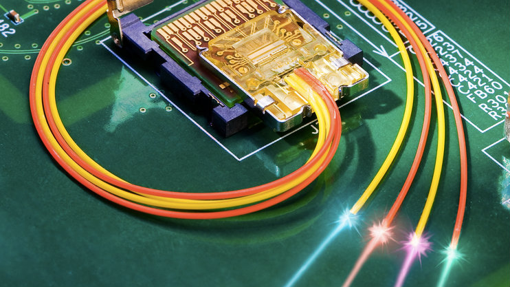
Intel's fastest connector to date uses light to transfer data at 1.6Tbps

This iPhone Air concept may have nailed Apple’s approach for its next iPhone

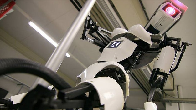
The Diving Bell and the Exoskeleton: An Excursion into the Depths

How to Make a No. 1 App With $99 and Three Hours of Work
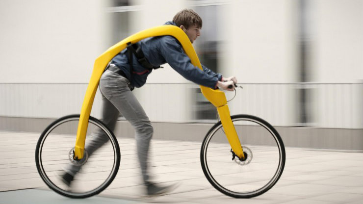
Is this a bike, a skateboard or just downright stupid?

A look back at technology we wish had worked: The Rocket Belt
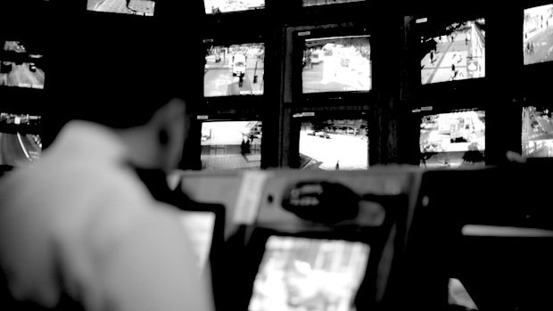
Is the Internet watching you sleep? The perils of unsecured webcams: The last one is just SHOCKING.

How the web was born: WWW turns 25

What the hell is this giant Russian car?
|
| Recaply Copy |
|